A great orthodontic website design can help you attract new patients and showcase your expertise. Meanwhile, high-quality photos of your practice, staff, and office help potential patients feel what it would be like to receive treatment from you.
You’ll also want to include detailed information about your treatments and any financing options or special offers to help convince potential patients to schedule a consultation.
Finally, including integrated appointment scheduling or virtual consults makes it convenient for potential patients to start working with your office.
Overall, a well-designed orthodontic website can help increase the visibility of your practice and make it easier for potential patients to learn about and choose your services.
FREE BOOK: Websites That Convert
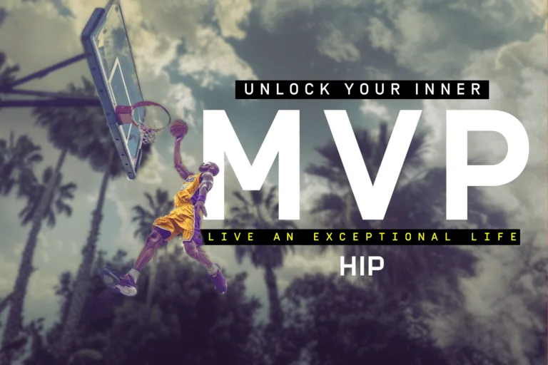
The Top 5 Orthodontic Web Designs of 2023
To help you see what goes into a genuinely great orthodontic website design, let’s look at 5 of the best ortho websites online today to see what makes them stand out.
Elevation Orthodontics
Know Your Audience
The first rule of marketing is “know your audience,” and Elevation Orthodontics hits this one out of the park!
While many orthodontists want to be everything to everyone, Elevation is highly-focused. They make it clear that they’re the go-to orthodontics practice for adults in the Nashville area. They lead with a fun adult-focused headline and follow it with consistent messaging throughout the page that doubles down on their core audience.

If you’re an adult looking for orthodontics treatment in Nashville, the hip, contemporary feel of Elevation’s website will make you feel right at home. It’s rare (and impressive) to see an orthodontist website lean this heavily into a single audience—but we applaud them for it!
Use High-Quality Photography
In addition to the copy, the photo and feel of Elevation’s orthodontic website are on-point. You won’t find awkward images of bracketed teens on this page; it’s all bright smiles and confident young adults in contemporary urban settings.
The photos establish the quality and credibility of Dr. Brice and his team to first-time visitors. It feels more like the place to be than a sterile orthodontics office. Elevation Orthodontics uses high-quality lifestyle photos to strengthen its brand!
Feature Team Profiles
Elevation creates two pages to highlight its team members—one for Dr. Brice and another for his operational team.
Your potential patients love to see your team’s faces and understand who they’ll be meeting with before they come into your office. Adding some trivia about them makes them feel more natural. It helps to make the experience personal—something that the corporate ortho chains can’t match!
FREE BOOK: Websites That Convert
Sparkman Orthodontics
BE BOLD with Calls to Action
When you want someone to do something online, subtlety is highly overrated. The best orthodontics website designs incorporate strong, bold calls to action that you simply can’t miss— like the REQUEST A FREE CONSULT button in the hero section of Sparkman’s website.

A large button in a boldly contrasting color draws your visitor’s attention and will increase the chances of them booking an appointment. And the focus on “free” lets them know there’s no financial obligation on their part—so why not sign up right now?
And, just in case you missed that button, Sparkman has a “sticky” red button in the right corner of their menu. Plus one more giant call to action at the bottom of the page as well, too.
Don’t let your clients wonder what they should do. Instead, include repeated bold calls to action promoting a free consultation in your orthodontic web design. It’s the easiest way to get new patients to your chair.
Show Off Your Local Awards
Do you remember that “Best of Your Local Area” award you got in your local paper? Of course, you do…but nobody else does unless you remind them of it!
Awards, especially user-voted awards, carry considerable authority in your local market and help to establish you as a leader in your region. So if you’ve been named the best orthodontist in your city or town, feature your awards on your orthodontic website!

Sparkman Orthodontics showcases 3 “Best Of” awards from their local media channels, creating immediate credibility with a huge percentage of their potential patients.
Create Location-Specific Landing Pages
If your practice has multiple offices or locations, it’s essential that your orthodontic website design doesn’t simply list the locations but also features individual pages for each office.
Why? It all comes down to Local Search Engine Optimization, otherwise known as Local SEO.
You’ll see that Sparkman lists all 3 of its locations at the bottom of its homepage. But each location is clickable, and the link takes you to a separate page featuring the individual office.
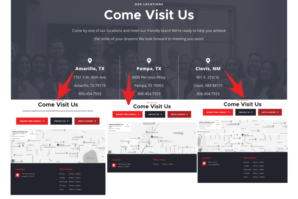
These location-specific pages on a website for orthodontists help signal to search engines that you have an office in that area. You can also use them as landing pages for paid advertising campaigns. And Sparkman’s location pages also include an embedded map to make it easy to find them—that’s a nice touch!
LifeSmile Orthodontics
Offer On-Site Appointment Booking
According to one study, 71% of patients prefer to schedule medical appointments online versus over the phone. Based on our direct experience with our 80+ orthodontic practices, that number is even higher for orthodontists!
When searching for an orthodontist on their phone or computer, finding a time that works and booking the appointment is easy. There’s no waiting for someone to answer the phone, discussing possible times, or getting put on hold.
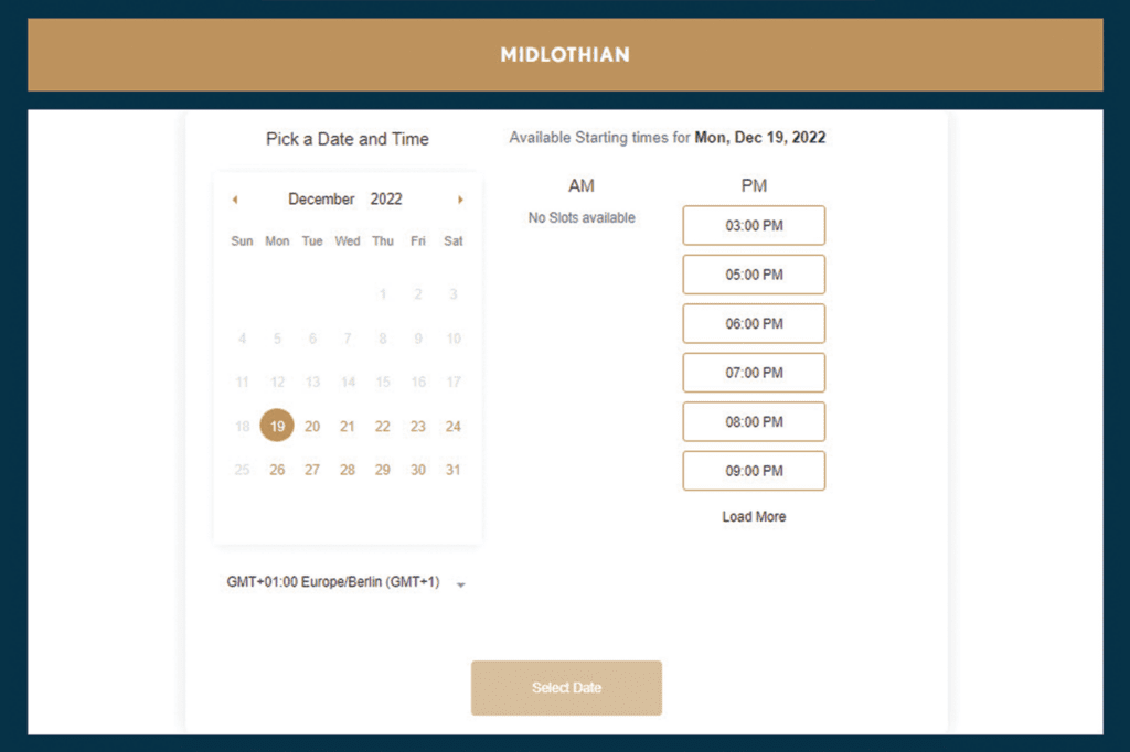
So offering an online appointment-booking app or plugin, like the one featured here on the LifeSmile website, is a must for any orthodontic website design today.
PRO TIP: Want to book even more appointments? Make sure you always have consultations available the same week, even if you double-book or squeeze people in. Your visitors are likely to book a consultation with the first doctor they can find available. If you don’t have appointments until next week, you risk losing their business to a doctor across town.
Feature Strong Patient Testimonials
Did you know that 86% of patients use online reviews to choose dental services? That’s a huge deal. But when designing your orthodontic website, you get to choose which reviews they read first!
LifeSmiles uses the power of positive testimonials in two ways. First, they feature a 5-star testimonial from Google on their homepage with a slider option letting you read more.
But then they link to a separate “Reviews” page filled from top to bottom with 5-star testimonials pulled directly from Google. So don’t be afraid to overwhelm your visitors with the sheer quantity of glowing reviews you’ve received!
Give an HD Office Tour
One of the main design goals for your orthodontic website should be to prepare patients for what to expect when they step through your office doors. The more comfortable they are, the more likely they are to start treatment.
A high-definition video tour, like this one on the LifeSmiles website, helps patients know what they’ll see once they’re inside. It also lets them see your face, hear your voice, and curate their first impression of your practice.

In the case of LifeSmiles, the HD video makes it clear that the office is new, high-tech, and optimized for comfort. The patient reviews focus on how comfortable the doctor and team make their patients feel. The LifeSmiles website does a great job on many fronts, but after watching this video, who would choose any other doctor for their orthodontic treatment?
Mill Creek Orthodontics
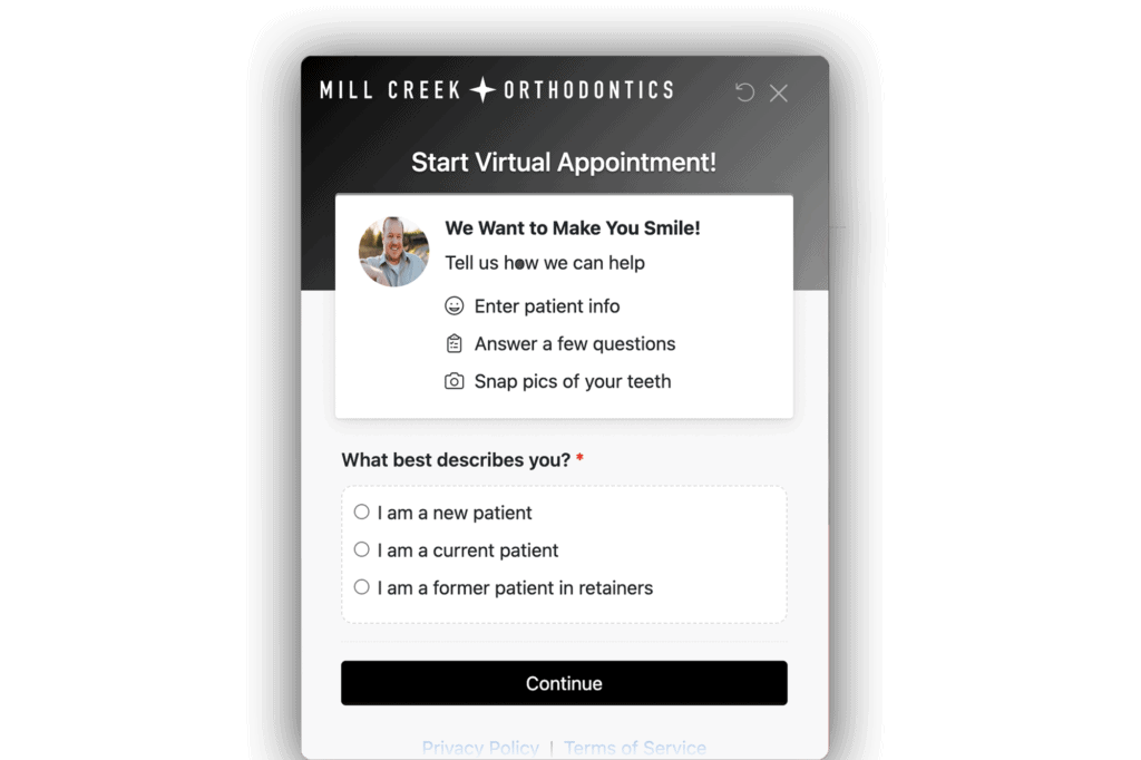
Integrate Virtual Consultations
Today’s patients are impatient. And their schedules are swamped. So if you can get the ball rolling on their treatment without ever coming to your office, they’ll likely choose you over a competitor in your area.
Dr. Markus of Mill Creek Orthodontics offers free “Virtual Appointments” through a website add-on powered by Smile Snap. In just a few minutes, visitors can share details and upload pictures of their teeth. Then they’ll get the results of their free virtual consultation delivered to their email inbox!
When someone is on your website, it’s often because they feel a need to do something about their smile right now. But that feeling could fade before they get around to booking a consultation. Virtual consults let you take advantage of their moment of highest interest to get the process started. And it also enables you to see more potential patients without tying up your valuable in-office appointments.
We recommend making virtual consults—with SmileSnap or a solution of your choice— a feature of your orthodontist website design.
Create a Payment Calculator
The days of waiting until the end of a one-hour in-office consultation to pull back the curtain on your pricing are over.
Patients want to know what pricing will look like before they book a consult. Besides, it’s not like the price of braces or Invisalign is a secret. There are plenty of places online to get the average cost of orthodontic treatment.
A payment calculator, like the one on Mill Creek Ortodontic’s website, can help potential patients estimate the cost of their orthodontic treatment. And it makes them more likely to follow through with their treatment plans.
What’s excellent about Mill Creek’s calculator is that visitors must register to use it. So even if they don’t schedule a consultation immediately, you can follow up with a targeted email campaign to encourage them to book a free consultation.
Include Service-Specific Landing Pages
Mill Creek features individual pages for each service category (braces, Invisalign) and age range (kids, teens, adults). This is a smart strategy for at least 2 reasons.
Firstly, these pages speak directly to the audience for each service and answer many of their questions. The page can help potential patients arrive at your office more prepared to start treatment and make your consultations run smoother and faster.
Secondly, service-specific pages help your site appear in more searches in your local area. For instance, Mill Creek ranks #1 on Google for the terms “Braces for Teens in Charlottesville” and “Invisalign for Teens in Charlottesville.”
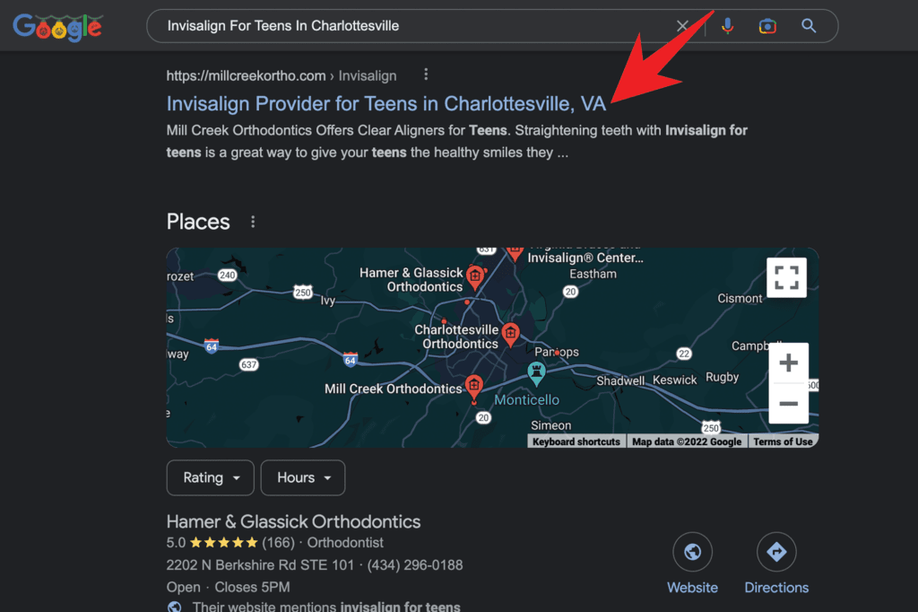
While they may not be high volume search terms, they attract highly-targeted traffic. So owning the organic traffic for these terms could easily bring in a few more consultations each week, which adds up quickly!
Garlock Orthodontics
Bring Your Smile!
Your headline is the most-read piece of copy on your website, so it’s vital to make an impact quickly. Research shows that the human attention span has dropped to just 8 seconds (lower than goldfish, by the way) over the past few decades. So you need to tell them why they should stick around…quickly!
One great way to do that is to lead with a smile, literally. Headlines that feature the word “smile” remind your visitors why they’re here. And it gets them excited to make their dream smile come to life.
When designing your orthodontic website, be sure to lead with a headline that’s on-brand and on-topic. Actually, all 5 of the websites we’ve reviewed here do a great job with their headlines, or they probably wouldn’t make the list—that first impression is too important to overlook.
Give Visitors A Roadmap
We’ve talked again and again about how your orthodontic website design should help prepare your visitors for what to expect when visiting your office. A roadmap makes it clear that starting treatment is easy.
Of course, you want to make it sound easy, too. Nobody wants to set off on a long and painful journey, so make them see how close their dream of a perfect smile actually is.
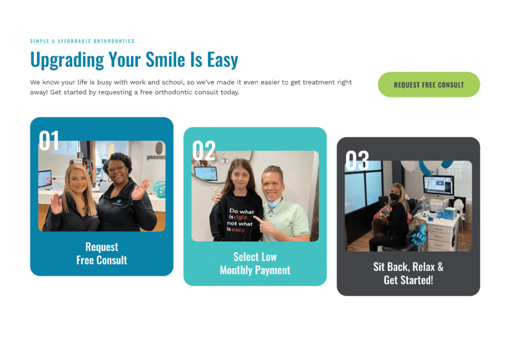
The 3-point roadmap that Garlock uses is nearly perfect. First, they lead off with a subheadline of “Upgrading Your Smile Is Easy,” and then they lay out three easy steps to get started. In the process, they focus on low-friction language, like easy, free, low monthly payment, and relax.
They make starting orthodontic treatment sound as easy as signing up for Netflix! And with their smiling team accompanying you at each step of the design, you feel like you’ll be in good hands.
Keep Things Organized
We’ll close this review of the best orthodontic web design ideas with a less-sexy but crucial aspect of your website design—the organization and structure.
A clean and well-structured sitemap and navigation menu make it easier for your visitors and Google’s search crawlers to find their way around the site.
You’ll see that Garlock organizes all their pages into four simple navigation links in the header. These are Our Practice, Orthodontics, Patient Resources, and Contact Us.
Within each menu, they organize their subfolders, so all of the “braces” pages are grouped together, all of the Invisalign pages are grouped together, and so on. This structure ensures that a developer can easily find their way around the back end of your site. And the menu structure ensures each page contains a link from the homepage, which helps Google’s search bots find the pages easily.
Overall, a well-planned and executed sitemap will make your orthodontic website easier to maintain and update. And it ensures that your visitors and the search engines will find the information they’re looking for.
Want to Guarantee A Winning Orthodontic Website Design?
At HIP, we’ve built high-converting websites for some of the fastest-growing orthodontics practices in the country. We can help you create a website that wins consults and starts more patients by incorporating all of the elements we discussed above.
What’s better? Your optimized orthodontic website makeover is included when you sign up for our Patient Acquisition and Retention Framework (PARF®).
We’ve used PARF® to create over $100M+ of added production for over 80+ orthodontics practices coast to coast, like Fishbein Orthodontics, Dr. Jennifer Orthodontics, Wentz Orthodontics, and dozens more.
Whether you’re a startup or an established practice, our proven marketing, software, and training modules can help you start more patients every month while creating an average of 400% return on investment.
Ready to grow the practice of your dreams? Reach out to HIP for a free consultation!